Multi-software “manual” approaches

Before the development of Rthoptera, being dissatisfied with the image output provided by the available bioacoustics software packages, the authors used screenshots from the relevant views obtained by closed-source software, mostly Adobe Audition (Adobe Inc., 2023).
Obviously, not being conceived for such usage, the screenshots need extensive manual refinements, that require the coordinated use of other closed-source software, that usually include MS-Paint and Adobe Photoshop. After the selection of the relevant portion of the audio file, the bare minimum of activities needed includes:
Taking a screenshot (i.e., copying current screen content in the RAM image clipboard);
Pasting the screenshot in the image editing environment;
Improving image clarity by adjusting image levels (e.g., brightness, contrast, sharpness, etc.). Other post-production interventions needed may include image mode conversion (color to black & white or vice-versa) and feature (e.g., grid lines) removal;
Adding readable vertical and horizontal axes, including tick marks, values and labels: even though the original screenshot may include such information, the on-screen font size is usually too small to be readable. Furthermore, if a non-initial section of the audio file is illustrated, the on-screen horizontal time scale does not start with zero, which complicates its reading. For those reasons, suitably sized and zeroed horizontal and vertical scales need to be juxtaposed to the image, in a time-consuming process. Usually, under Windows operating system, this activity is performed with MS-Paint. On average, obtaining each image may require from 10 to 20 minutes of work (e.g., as in Brizio et al., 2021). The raster images emerging from the process described are sufficiently clear, but there are drawbacks, including:
Image content is limited to the views available in the audio analysis software: usually, this boils down to time/pressure envelopes, spectrograms and mean spectra;
Composite images (e.g. time/pressure envelopes at different time scales, or combination of mean spectra and spectrogram) cannot be obtained in a single step, and require a mosaic of separately generated images;
Images do not include any data besides those appearing in the image itself. If further data are needed for the purpose of the publication, they must be obtained in other ways, typically by manual transcription of values read on screen, often obtained by suitably positioning the mouse pointer, e.g. in the case of the reading of pressure levels from mean spectra (not forgetting that the pixel-wise process of pointer positioning is inconsistent and error-prone);
Image style (e.g., color coding of pressure levels) may vary from one image to another, depending on the software used for screenshot generation.
The whole process described above is highly dependent from the skill, the experience and the individual sensitivity of each operator, and consistency of the results by different operators is not fully granted.
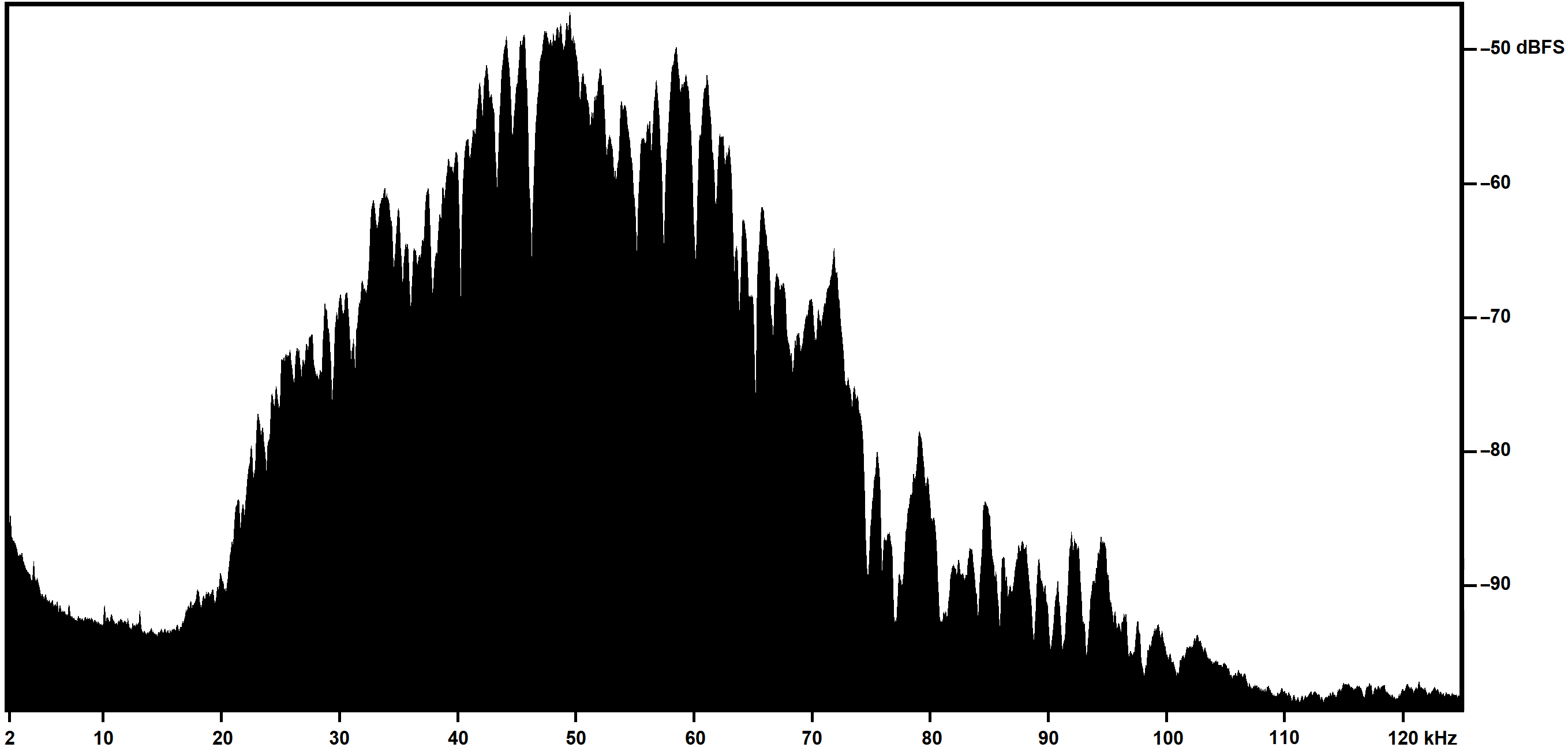
This is an example of a Mean Power Spectrum extracted from a screenshot from Adobe Audition and post-processed in Microsoft Paint and Adobe Photoshop to change the color scale and add new axes labels, requiring about 10 minutes to produce:
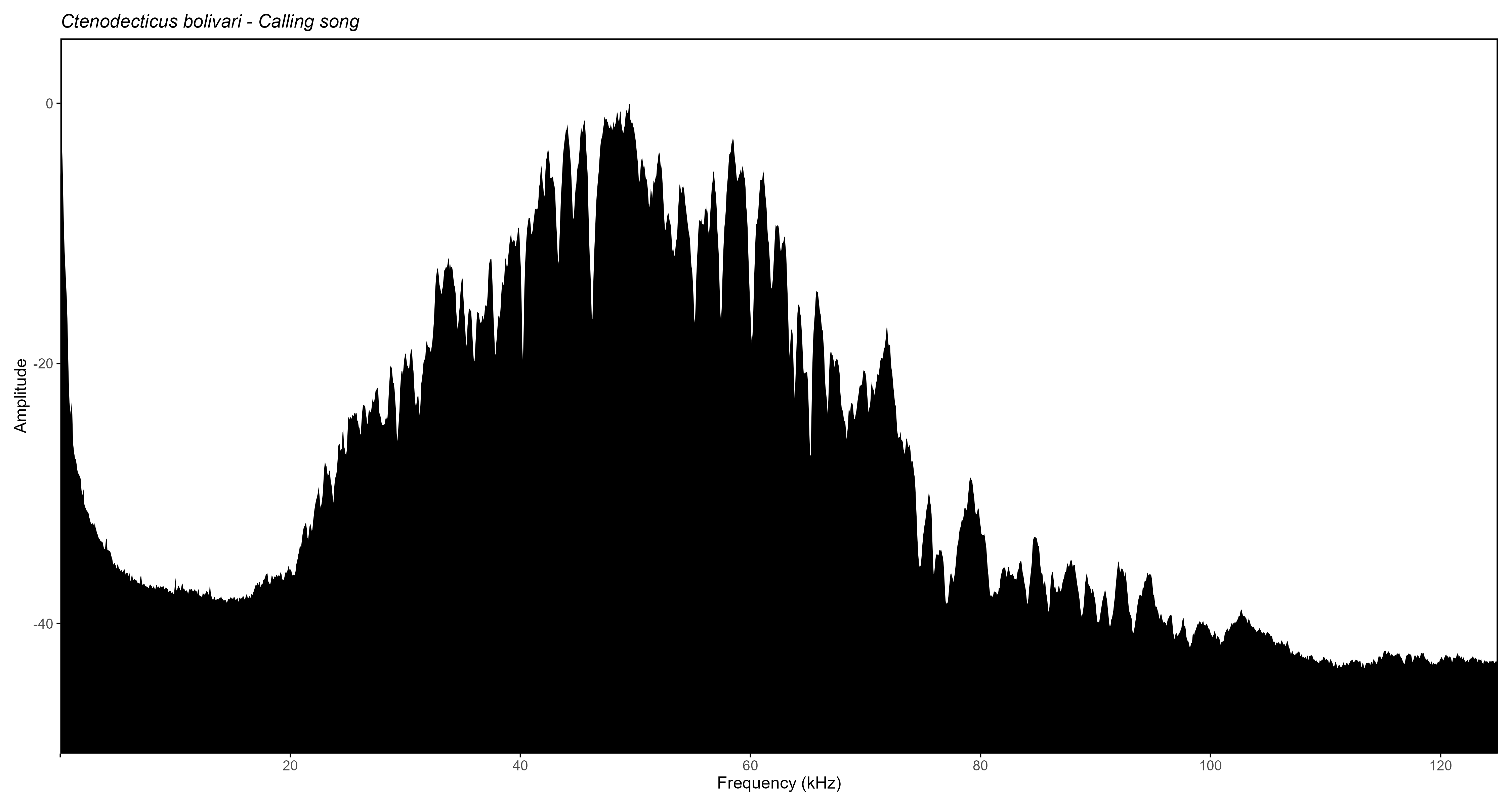
Below is the same plot type produced by Rthoptera
(using normalized amplitude instead of dB FS), which took 45 seconds to
produce, including the selection of the file, changing scale parameters
and custom labels on the Y-axis, modifying the output dimensions, and
typing down the species name and song type.
Raven Pro 1.6
NOTE: For this comparison we used a machine with Windows 11 Home, 64 bit, 16 GB RAM.
Raven Pro 1.6 (Cornell Lab of Ornithology, 2021) is a dedicated bioacoustics software build by and for scientists. Even the free version Raven Lite offers a suite of useful tools for acoustic analysis, and is extensively used by researchers in acoustic communication of birds, anurans, bats, and other mammals. One disadvantage of this software is its proprietary nature, limiting the user’s ability to customize the plots and forcing them to rely on extra software to obtain the desired results. The plot shown below took about 70 seconds to make in Raven Pro 1.6, including un-checking the position marker (which is wrongly shown in many scientific publications), adjusting the zoom level on the oscillogram, the window size and contrast for the spectrogram, and finally changing to grey scale in Microsoft Office, which does not allow to control the output dimensions either:
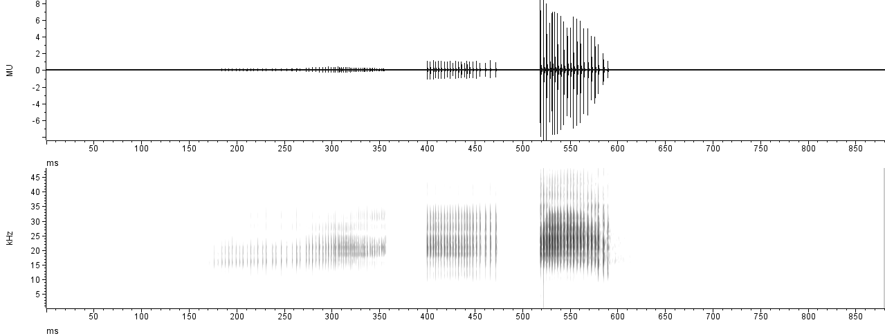
While the output is nice, it is far from customizable, and the
user can’t control the output parameters either (e.g., image
dimensions). To our knowledge, all the plots in Raven
are separate views, not allowing to add a Mean Power Spectrum aligned on
the side of the spectrogram. If we wanted to achieve the same output as
in the “multi-plot” from Rthoptera, we would have to manually
paste the spectral plot on the side, requiring a manual adjustment of
the dimensions which would likely distort the axes labels. If we
consider iterating this process over many recordings, it translates into
a very tedious endeavor.
In Rthoptera, the final output can be obtained in about 10 seconds without these extra manual processing. First, we will load some Waves from the RthopteraSounds package:
library(Rthoptera)

# Load the sample recordings
library(RthopteraSounds)
data("coryphoda")
data("tettigonia")
data("gryllus")
Then, we launch the app multi_plot app with the
following call:
launch_app("multi_plot")
Here we can modify some parameters before computing the
plot:
This is the exported image:
Note that in R, the warbleR
package also allows to extract spectral statistics automatically, but it
requires importing selection tables from Raven, which
makes the process longer.
Rthoptera’s Interactive Plots
One of the main features of our package is interactivity. Several
functions and apps produce interactive plots that can be saved as HTML
documents for end users to explore. Here are some examples on how to
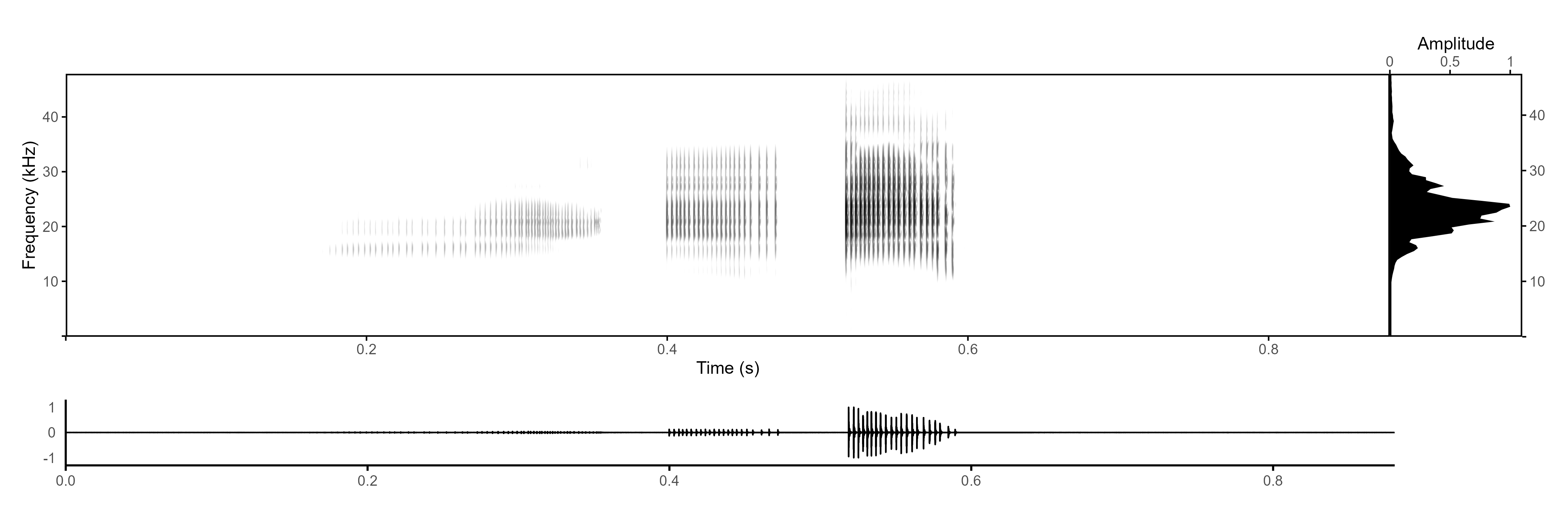
obtain interactive plots using the tettigonia Wave object
from RthopteraSounds:
First, let’s make an interactive oscillogram with the oscillogram_plotly function:
data("tettigonia")
# Interactive oscillogram (aka waveform)
oscillogram_plotly(tettigonia)
An ancillary interactive spectrogram can be obtained with the spectrogram_plotly() function. Note that the interactive spectrogram was added mainly as an aid during preprocessing (band-pass filtering) and is not intended for illustrating a signal in a professional way (hence the blueprint style):
# Interactive spectrogram (aka sonogram)
spectrogram_plotly(tettigonia)
An interactive Power Spectrum can be obtained with the
spectrum_plotly() function. This plot shows a black linear
scale spectrum on top of a grey dB scale spectrum:
# Interactive mean power spectrum (aka PSD)
spectrum_plotly(tettigonia)$plot
Rthoptera’s Temporal Metrics
While all the importing and preprocessing apps were added here just to make your life easier, the core of Rthoptera’s contribution to insect biacoustics is the automatic detection and characterization of temporal units. By playing around with a few parameters, you can specify what to measure, and Rthoptera will do the rest. Most of the available tools for automatic measurement of acoustic signals are based on a simple amplitude threshold which will separate a signal from background noise. That approach is enough to measure most high-SNR recordings of tonal songs, such as those produced by most ground-, tree-, and field-crickets. However, when you want to measure broadband stridulations such as those produced by most katydids and bush-crickets, there are other things to consider. These broad-band songs are characterized by transient-like “clicks”, often reflecting individual impacts of the stridulatory teeth on the scraper. In our neutral nomenclature, we call these sounds ‘peaks’. Researchers are often interested in measuring the number of peaks in each ‘pulse’ (i.e., a continuous train of waves) or, as we call it, ‘train’. The problem arises when some of these peaks are too faint to measure with the threshold approach, falling below the threshold if we want to filter out the reverberations of the signal. Rthoptera solves this by detecting local peaks with user-defined parameters. The song_stats_lq app (and function) creates the following outputs:
• An interactive plot showing individual peaks, trains, motifs, and motif sequences (when motif_seq = TRUE) as well as reporting summary statistics of the main measurements.
• A tabular dataset including: peak, train, motif, and motif sequence measurements, a summary table and another table with all the parameters used in the analysis. All the temporal measurements are based on the peak detections.
You can use Plotly’s tools to zoom-in and explore the peak detections, especially in the fainter train. Note that the ‘Summary Statistics’ panel can be toggled off by clicking on the text in the legend, and the same is true for all the rest of the elements in the plot. For each train detection, spectral statistics are calculated, which can be accessed in the train_data table. In this example, we will use the console to work with the function directly:
# Using a low detection threshold
results <- song_stats_lq(coryphoda,
                         detection_threshold = 0.01,
                         motif_seq = FALSE)
# Show the plot
results$plot
Note that any element of the plot can be toggled off from the legend
pane. The plot can be downloaded as an HTML from the ‘Export’ menu in
the Rstudio’s viewer pane.
Now let’s inspect the results in the output tables:
# Summary
View(results$summary_data)

# Peaks
View(results$peak_data)

# Trains
View(results$train_data)

# Motifs
View(results$motif_data)

# Parameters used
View(results$params)
The Coryphoda analysis is a perfect illustration for the
Temporal and Dynamic Excursion metrics in the
song_stats_lq() function. If we used an amplitude threshold
approach, we would likely have to ignore the first train, which is
produced when the male opens its tegmina (forewings). However, the peak
detection approach allows us to capture this faint sound which is packed
with information. Let’s focus on the “train_data” table:
| specimen.id | motif.id | train.id | tem.exc | dyn.exc | train.start | train.end | train.dur | train.period | train.gap | n.peaks | mean.amp | peak.rate | peak.freq | low.freq | high.freq | bandw | sp.exc | sp.ene | sp.ent | sp.flat |
|---|---|---|---|---|---|---|---|---|---|---|---|---|---|---|---|---|---|---|---|---|
| 1 | 1 | 37.4 | 0.092 | 0.1848 | 0.3549 | 0.170 | 0.216 | 0.045 | 56 | 0.025 | 323.5 | 21 | 12.8 | 26.2 | 13.4 | 51.083 | 108.622 | 0.813 | 0.386 | |
| 1 | 2 | 7.8 | 0.103 | 0.4003 | 0.4723 | 0.072 | 0.119 | 0.047 | 22 | 0.101 | 291.7 | 21 | 13.5 | 34.5 | 21.0 | 69.973 | 193.646 | 0.803 | 0.260 | |
| 1 | 3 | 8.9 | 0.868 | 0.5192 | 0.5897 | 0.071 | NA | NA | 21 | 0.639 | 281.7 | 24 | 14.2 | 33.0 | 18.8 | 62.967 | 187.796 | 0.772 | 0.214 |
Of course, if you prefer, you can use the app:
launch_app("song_stats_lq")
Note how the Temporal Excursion (“tem.exc” column) is much higher in the first train, which is also the longest (“train.dur” column), with the highest number of peaks (“n.peaks” column), the faintest (“mean.amp” column), and the flattest in terms of energy, with the lowest Dynamic Excursion (“dyn.exc” column). The opposite is true in almost all metrics for the last train (closing stroke); it is the shortest, with the lowest number of peaks, the loudest, with the greatest change in amplitude (Dynamic Excursion).
If you want to analyze tonal, “high-Q” songs, such as those produced
by most crickets, you should instead use the
song_stats_hq() function. In this example, we will use the
gryllus Wave from RthopteraSounds. We will also add
another level of aggregation by leaving motif_seq = TRUE
(Default) in the arguments:
# Use the song_stats_lq() function with a low detection threshold
song_stats_hq(gryllus,
              specimen_id = "gryllus_001") #optional

# Show the plot
results$plot
Note that when you don’t assign the function call to a new object (e.g., some_object <- song_stats_hq(gryllus)), the output is only printed on the console, which is not optimal when there are many columns which remain hidden.
Conclusions
Rthoptera is capable of improving the efficiency and effectiveness of the analysis of insect signals:
by granting a more objective approach: the user chooses the parameter values, and the image plus data tables generation is entirely and consistently managed by Rthoptera, excluding the vagaries of a lengthy manual process and the impact of different operators habits or manual skills;
by granting an advantage in terms of time required for image generation: even though R and RStudio are not especially suited for bioacoustic analyses, the worst-case scenario observed during the tests (up to 100 seconds for the generation of a composite image with Rthoptera) compares very favorably with the 20 or 30 minutes required to obtain a comparable image by the screenshot-based process illustrated above;
by generating the publication-ready plots, including composite illustrations (i.e., “multiplot”) that would be more tedious and time-consuming to generate with a multi-software approach.
by simultaneously producing multiple tabular datasets with diverse levels of aggregation;
by providing new metrics (Pattern Complexity, Broadband Activity, Temporal Excursion, Dynamic Excursion, etc.) that may set a standard for future investigations.
References
Adobe Inc. (2023). Adobe Audition (Version 23.0) [Computer software]. Adobe. https://www.adobe.com/products/audition.html
Brizio, C.; Buzzetti, F.M.; Pavan, G. Beyond the audible: Wide band (0-125 kHz) field investigation on Italian Orthoptera (Insecta) songs. Biodivers. J. 2020, 11, 443–496. https://doi.org/10.31396/Biodiv.Jour.2020.11.2.443.496.
Cornell Lab of Ornithology. (2021). Raven Pro: Interactive sound analysis software (Version 1.6) [Computer software]. https://ravensoundsoftware.com/